Mental Health progress tracking
KooKoo APP aims to make mental healthcare more accessible and empowering by providing a user-friendly tool for individuals to track their therapy progress and take control of their mental well-being.
Why to start this mental journey?
Problem statement
The world is finally shedding the stigma around mental health. The pandemic highlighted its importance, with more people in Spain seeking professional help (RTVE). However, navigating therapy can be confusing. There’s a lack of tools to track progress, and results aren’t always readily apparent. This can lead to discouragement.
KooKoo is here to change that. We envision a world where mental healthcare is accessible and empowering. Our user-centered app provides the tools you need to visualize your progress, stay motivated, and thrive on your mental health journey.
In this context, the goals we set for initiating research related to Mental Health were:
- Understand the perception of mental health.
- Understand the experiences of people with therapy, to identify behaviors, needs, and frustrations.
- Understand the process of choosing a therapist.
Our approach
Kick off
Our team had six passionate designers. They set out to create solutions for mental health care. We knew we’d needed a solid method for this tough journey. So, we chose the Triple Diamond framework.
Problem Discovery
To start, we dove into a sea of knowledge. We did this by doing in-depth interviews. Each conversation was like a flash of light. They helped us understand the needs and challenges people faced with mental health. This allowed us to find insights and to define the user persona.
Solving Discovery
We used a thorough Ideation process with tools like How Might We? and Value Complexity Matrix. We also used Information Architecture, among others. This process helped us create the foundations for Journey Mapping and the Storyboard. These will let us share the Selected Solution for this project.
Development
With the previous information, we’ve brought the KooKoo prototype to life. But, we know it is still crucial to test this prototype with Usability Testing. And, we also need more interviews before starting development.
Learning from our users
Problem discovery
We wanted the users to tell us about their experience directly, rather than us doing it for them, in order to empathize with them.
However, given that mental health is still a taboo subject today and that we didn’t want anyone to feel exposed, we used A.I. to create a narrative version of “Raquel”, our User Persona:
Interviews
Problem discovery
We conducted in-depth interviews to gain a deep understanding of user needs and challenges. This led us to the following key insights:
- Fear of the unknown leads people to rely on referrals for therapists.
- Building trust with a therapist is a personal process.
- The invisibility of progress can be discouraging.
- Lack of information about therapy can make it seem overwhelming.
Based on these insights, we’ve designed KooKoo, an app that lets you:
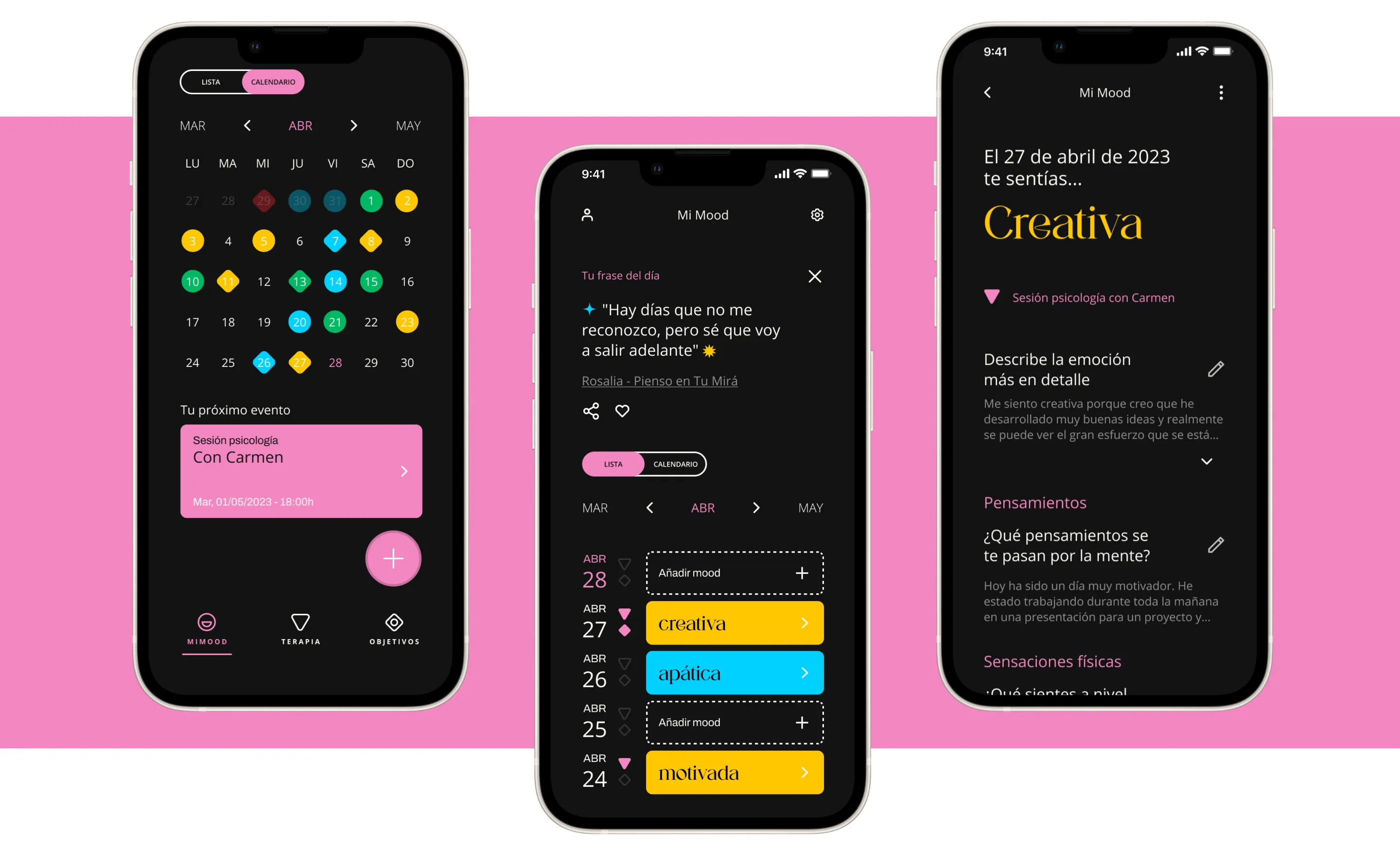
- Visualize your progress: Track your mood, goals, and milestones in therapy sessions.
- Stay motivated: See how far you’ve come, keeping you engaged in your journey.
- Feel empowered: Take control of your mental health with a user-friendly and supportive tool.
Time to create a solution
Solution discovery
From Insights to Solutions
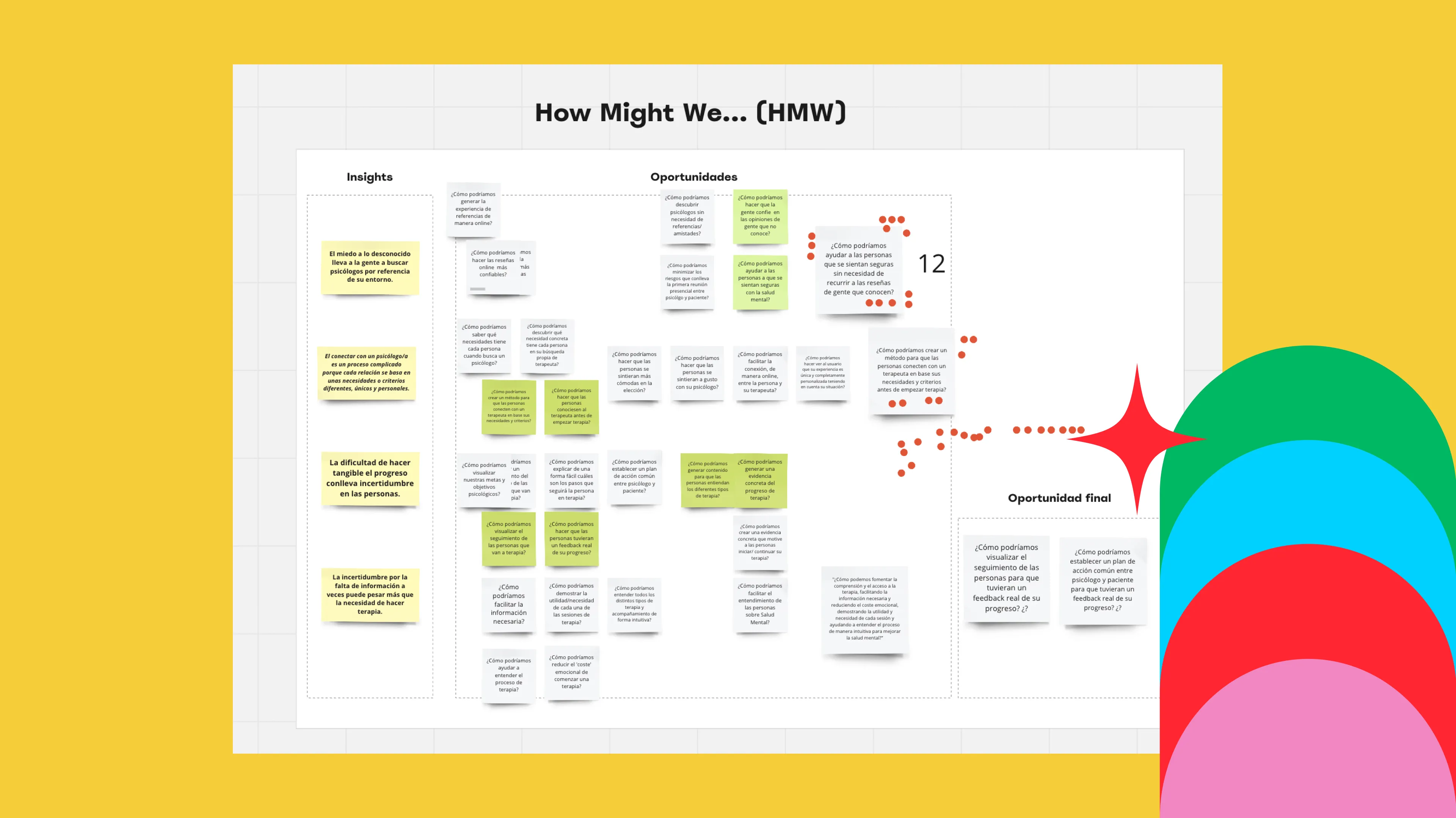
To transition from insights to defining opportunities, we employed the “How Might We” technique. And to move from opportunities to establishing solutions, we utilized the “SCAMPER” technique. This enabled us to find two very interesting potential solutions. But, combining them was hard.
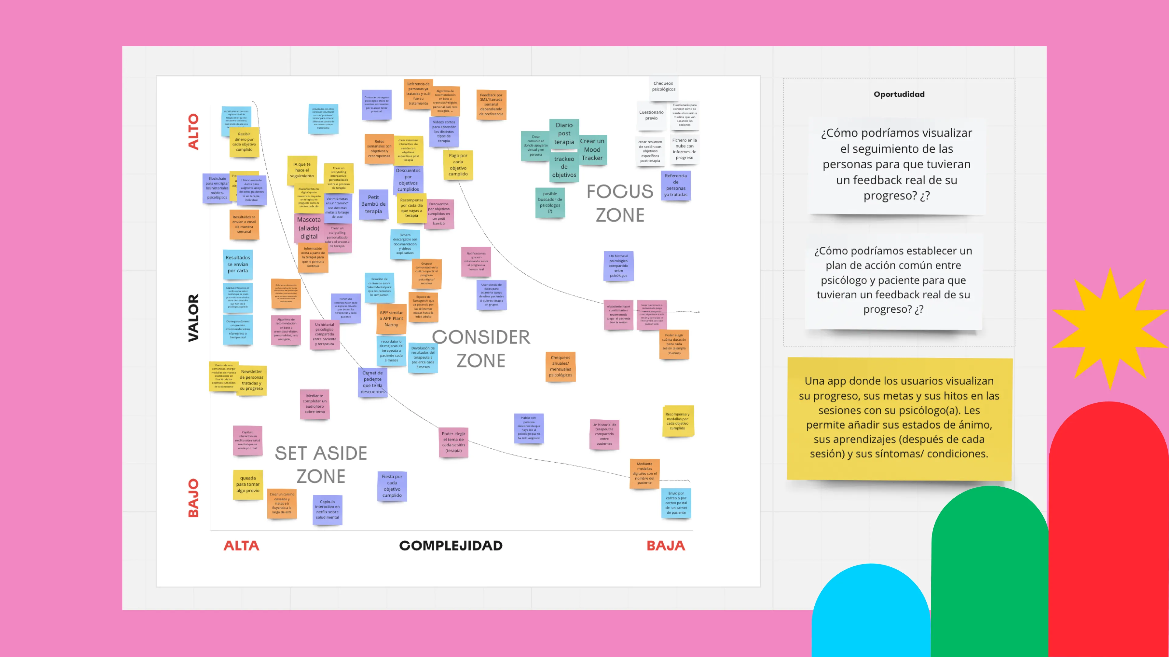
Prioritizing Solutions: Value Complexity Matrix
We used the “Value Complexity Matrix” to rank the solutions. As a team, we reached a consensus by considering solutions based on:
The value they offered to users and the technical complexity.
The Final Solution: A Progress Tracking App
The final solution we defined was:
“An app where users can visualize their progress, goals, and milestones in their sessions with their therapist”
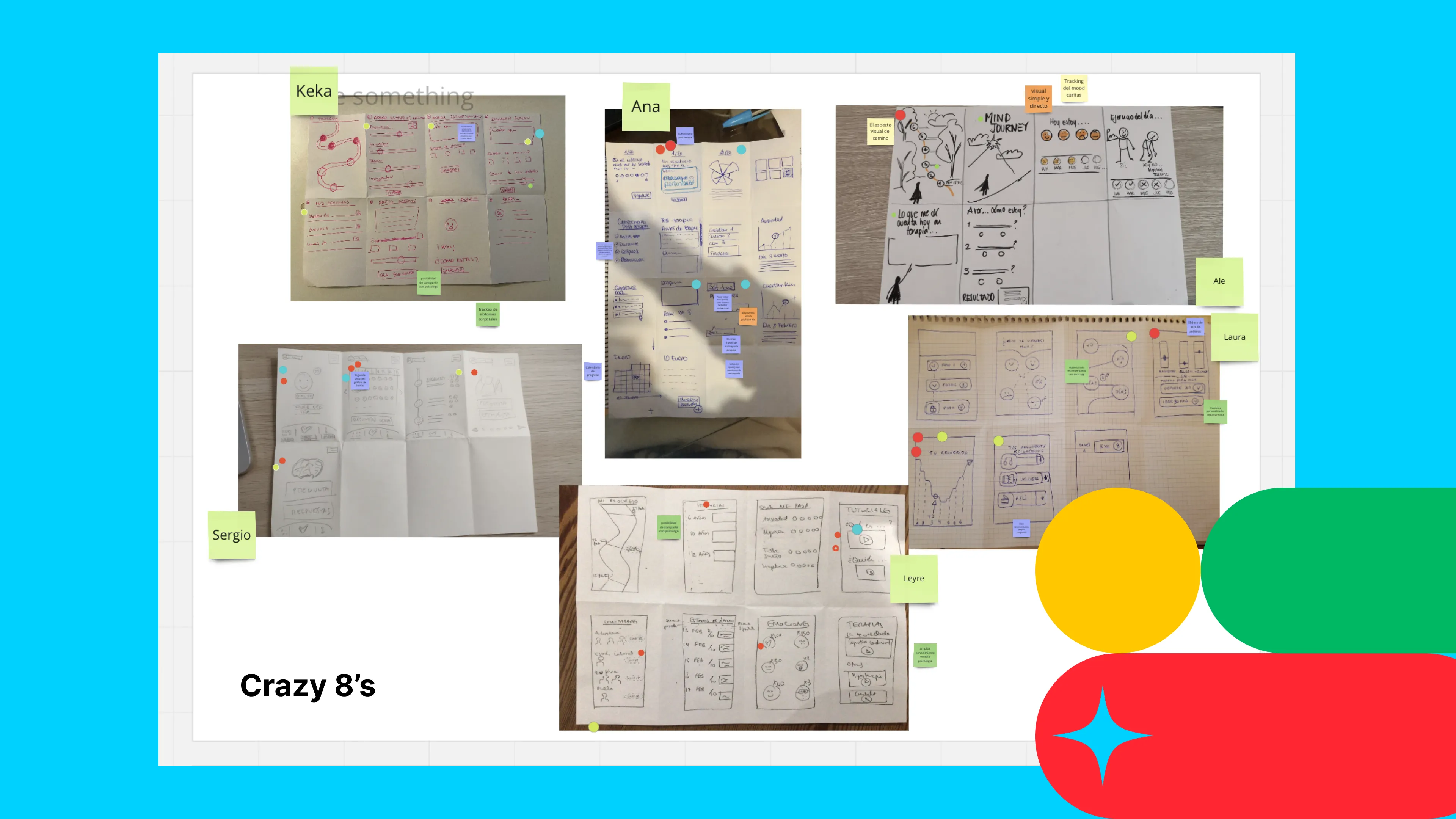
Brainstorming process
With the solution defined, we conducted a brainstorming exercise using the Crazy 8’s technique to start defining the prototype.
Then, we applied the MoSCoW technique to rank key functions. This significantly helped our team agree on the essential features for the initial product phase.
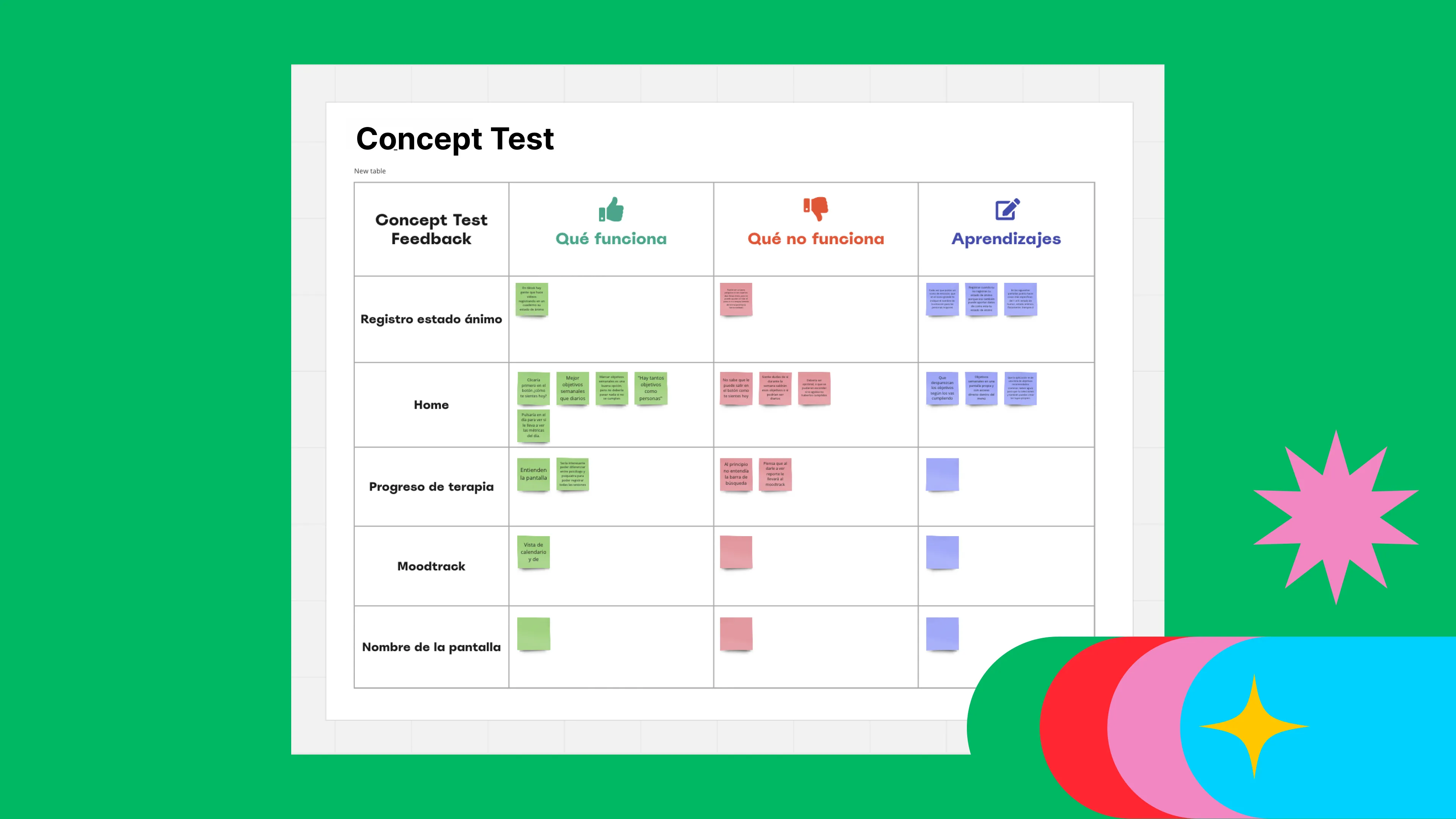
Solution Sketch and Concept Test
Next, we’ve created a Solution Sketch to rank the screens we needed to validate with users through a Concept Test. This helped us gather user feedback on the functionalities that were most helpful to them.
Finally, we designed the Information Flows of the KooKoo APP.
Prototype needs to be born
Solution discovery
Unveiling the Selected Solution: Journey Mapping and Storyboarding
Two powerful tools help us visualize the user experience and make informed decisions:
Journey Mapping: We meticulously map out the user’s entire journey with the potential solution. This includes their thoughts, emotions, and pain points at every touchpoint. By seeing the journey, we can find chances to improve the user experience. We can also ensure the solution fits well into their lives.
Storyboarding: We craft a compelling narrative that brings the user journey to life. This storyboard acts as a visual representation of how users will interact with the KooKoo app and enjoy its features. It allows us to see the solution’s flow. And we can spot roadblocks and improve the design. This way, we ensure a smooth, easy experience.
Together, journey mapping and storyboarding provide a clear picture. As they show the user’s experience with the chosen solution. This empowers us to make data-driven decisions and refine the concept before moving on to prototyping and testing.
Interaction Design
Solution discovery
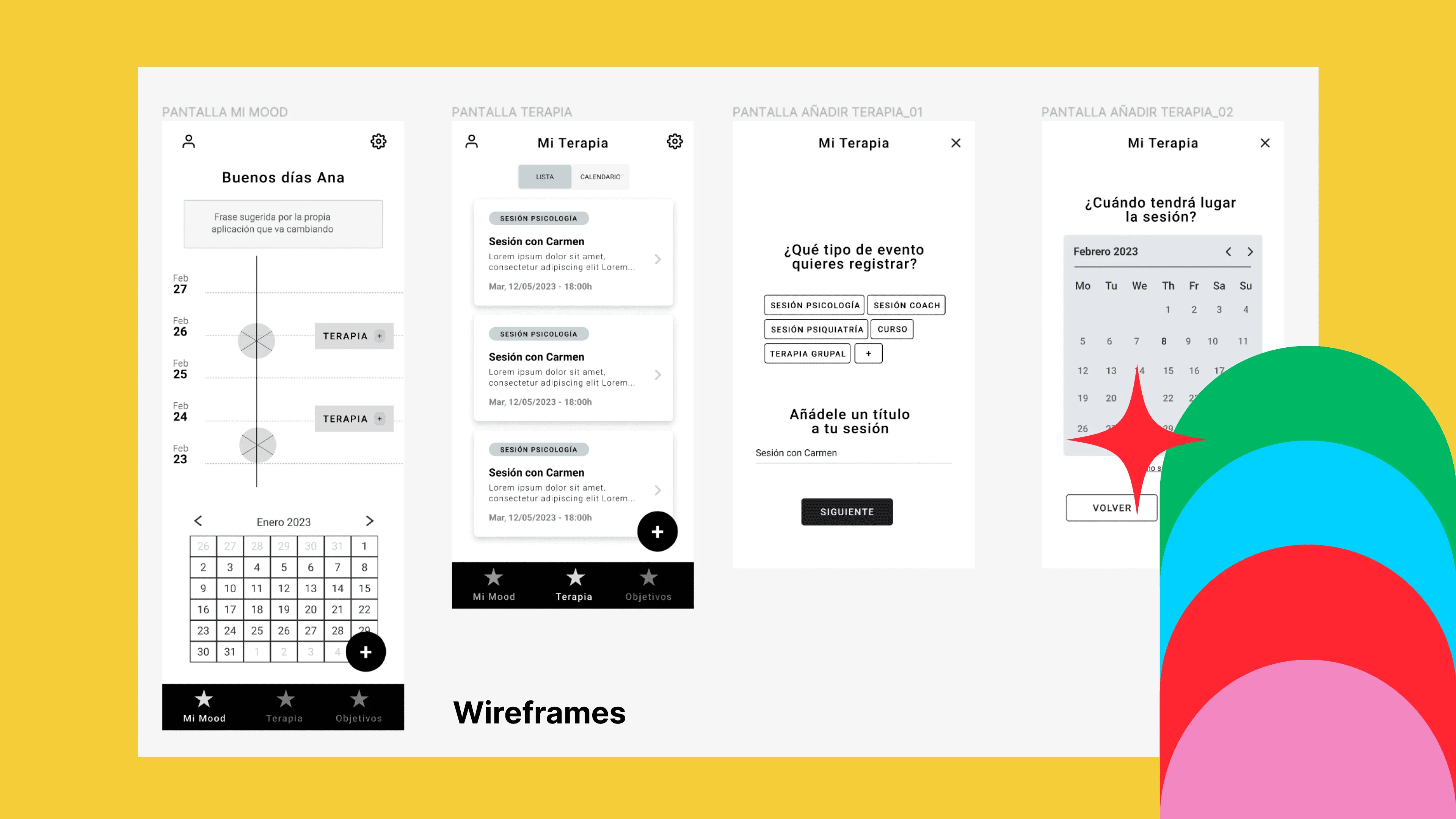
Laying the Foundation: Wireframing the Core Pillars
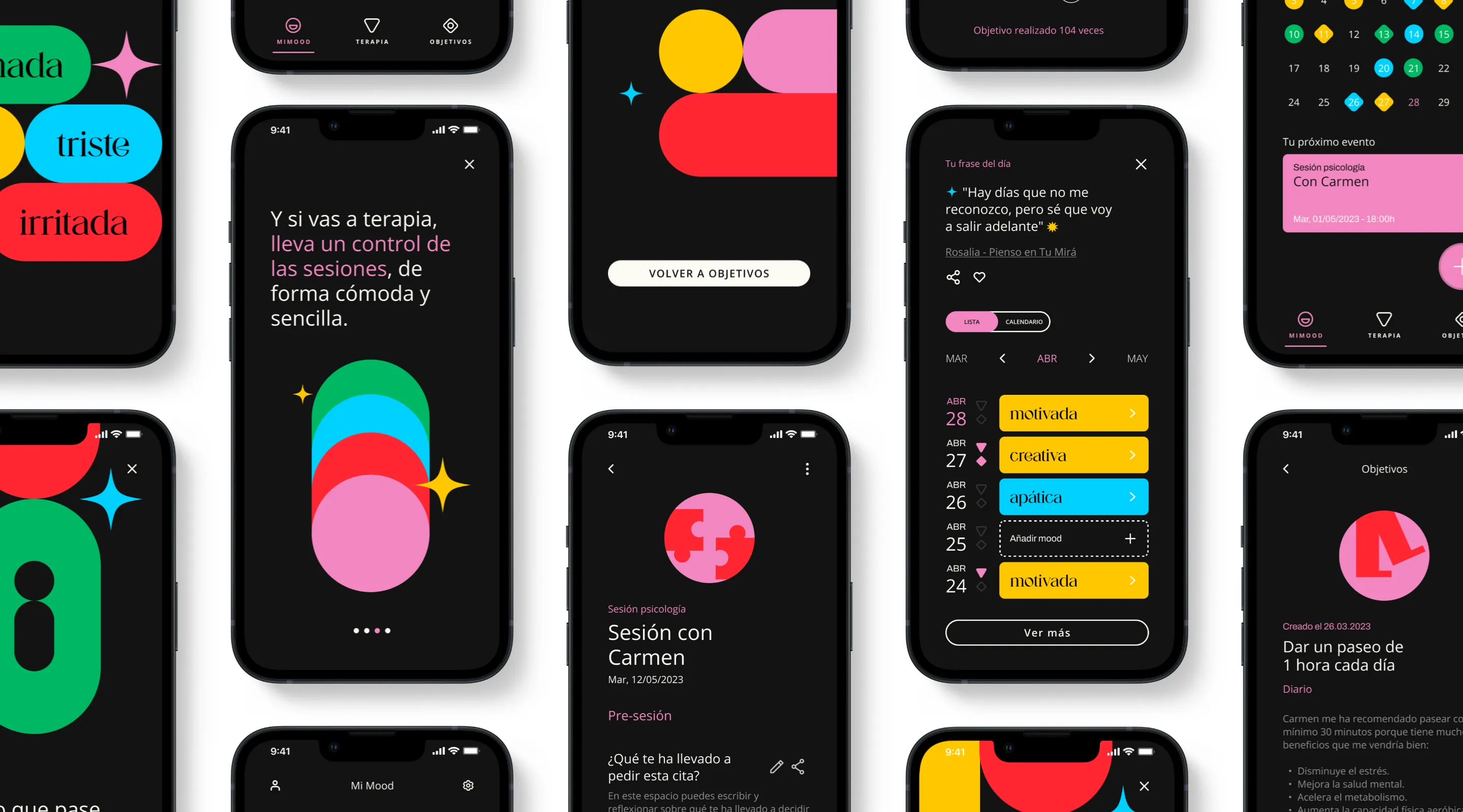
To bring KooKoo to life, we meticulously crafted wireframes for the app’s three key pillars:
My Mood - My Therapy - My Goals
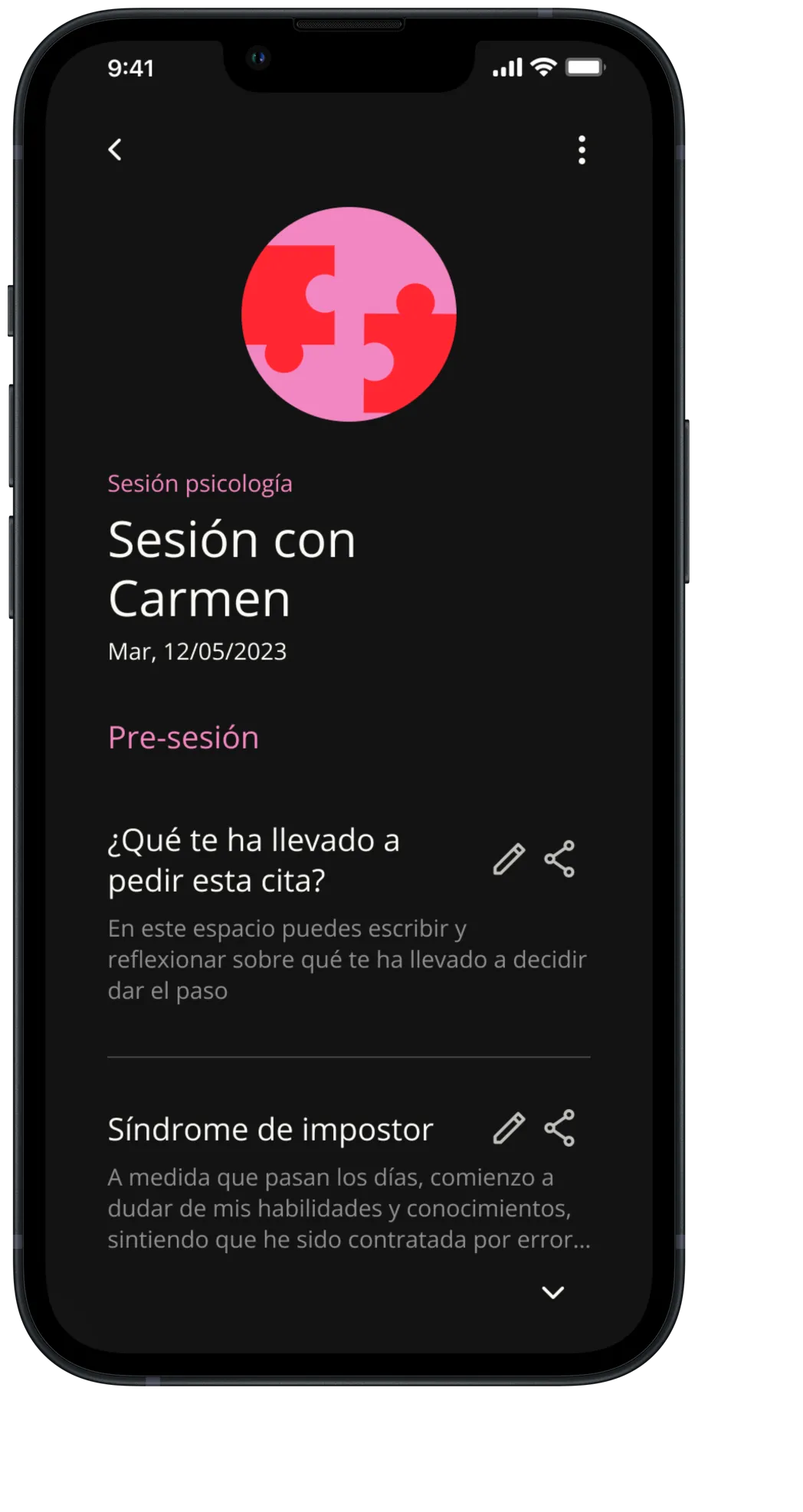
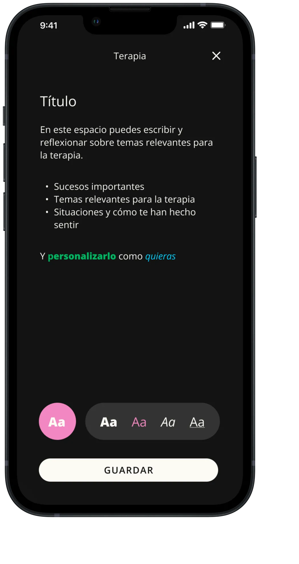
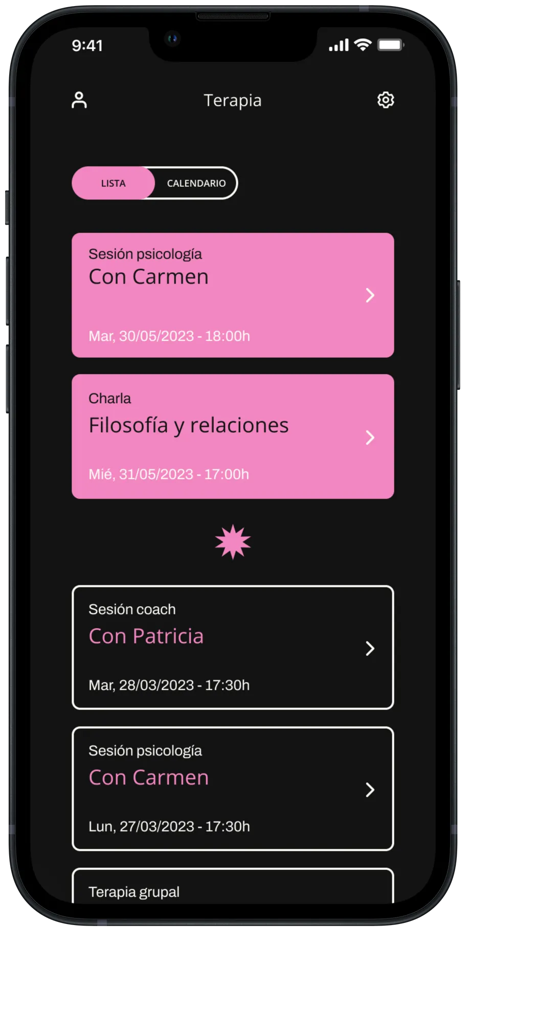
These wireframes served as blueprints, defining the app’s structure, layout, and user flow. We carefully designed each wireframe. They ensure a seamless and easy user experience. And they lay the foundation for the app’s functionality.
Prototype
A Design that Reflected the Brand
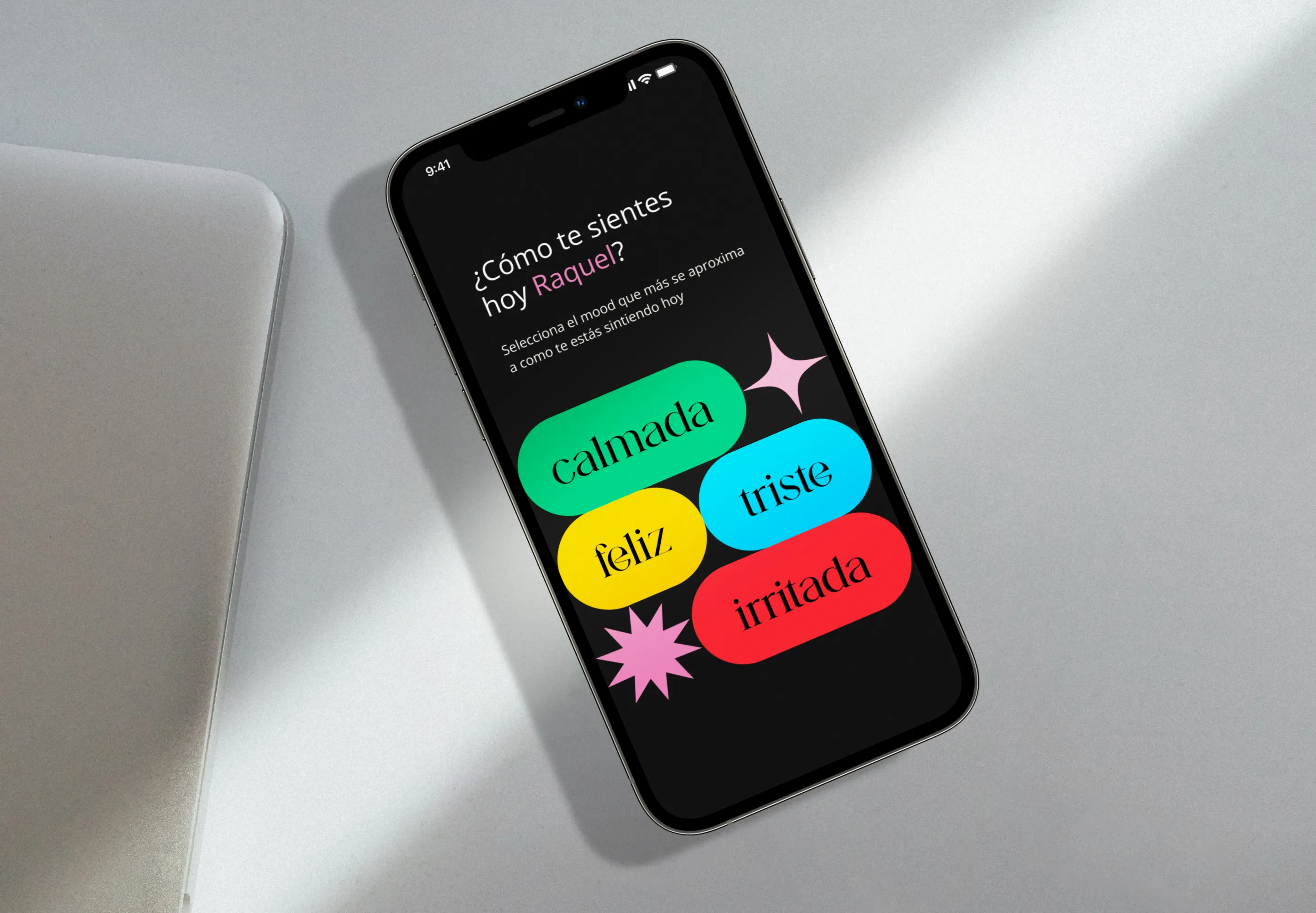
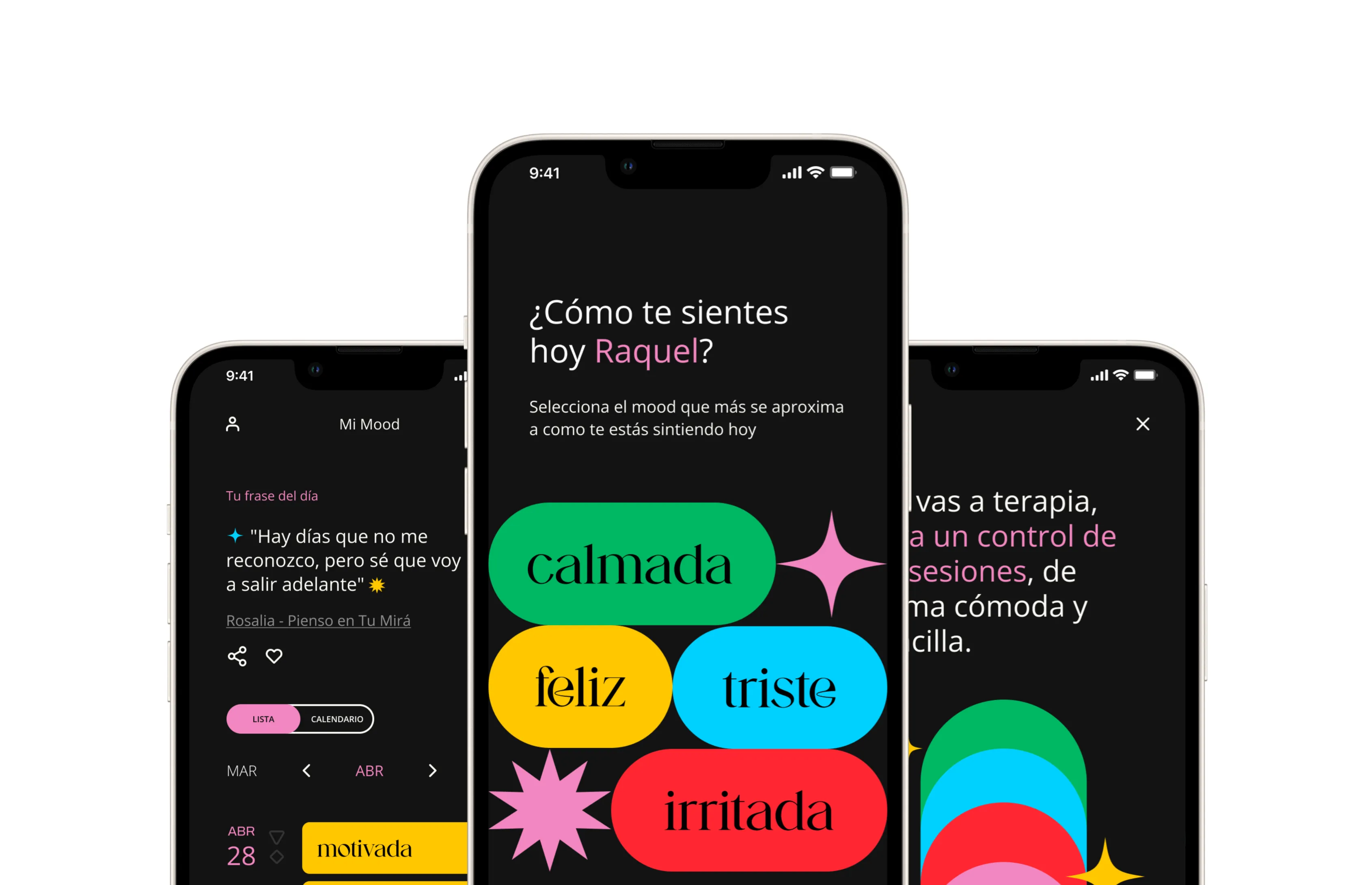
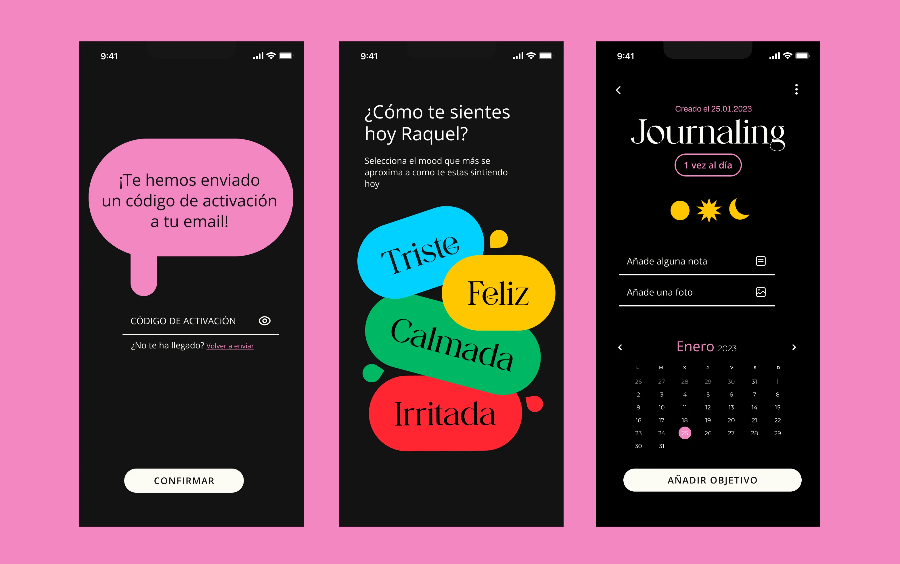
The final design struck a perfect balance. It balanced function and looks, capturing KooKoo’s mission. The interface is clean and uncluttered. It is easy to navigate. This lets users focus on their mental health journey without distractions. The color palette is calming and inviting, fostering a sense of tranquility and well-being. And the typography is clear and legible, ensuring users can easily access the app’s valuable information and features.
A Journey of Design Iteration
The process of designing KooKoo’s interface was a journey of continuous iteration and refinement. We constantly sought feedback from our team and potential users. We used their insights to improve the experience. This collaborative approach ensured that the final design not only met our high standards but also resonated with the needs and preferences of our target audience.
A Design that Empowers Users
The interface is not just a visual representation. It’s a powerful tool. It helps users take control of their mental health journey. The KooKoo interface is simple, modern, and easy to use. It seamlessly fits into users’ lives. It gives them the support and guidance they need to thrive.
Branding
Solution discovery
Demystifying Therapy: A Design Approach
The journey of therapy can sometimes seem hazy and undefined. But our in-depth research has revealed that therapy has a clear structure and form. This understanding guided our design choices. It led us to use simple, geometric shapes to show concreteness and clarity.
The Name Game: Finding the Perfect Fit
As we approached the final stretch of our journey, the app’s name remained the missing piece in the puzzle. Naming an app requires creativity and care. After two months of brainstorming and countless ideas, we’d had our aha moment: the name had to be Kookoo.
The clarity with which the app emerged was a testament to the thoroughness of our process. We’d explored various options, delving into the app’s essence and target audience, and KooKoo simply felt right. It was a name that was both memorable and meaningful, perfectly capturing the spirit of our app.
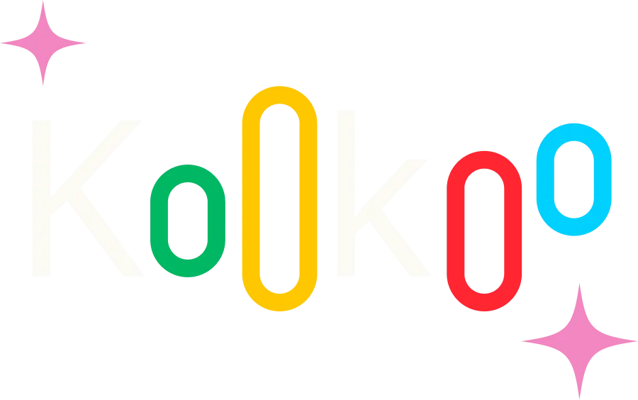
The Dynamic Duo: Unveiling the Logo
At the heart of our app lies a logo that embodies the essence of Kookoo – a symbol of emotional fluidity and resilience. The two “o”s, the central elements of the logo, are not static but rather dynamic, expanding and contracting to mirror the ebb and flow of our emotions. This small yet powerful design choice serves as a constant reminder. It reminds us that our moods and feelings are ever-changing. It also reminds us that Kookoo is here to support us through every twist and turn.
Color
Solution discovery
Color Psychology: A Symphony of Emotions
Color psychology is key in our app. Each emotion has a color. Yellow is for happiness, green is for calmness, red is for irritability, and blue is for sadness.
Pink: The Quintessential Hue
Pink is the primary color. It embodies warmth, hope, and sensitivity. Black is the counterpoint color. Backgrounds use it to accentuate the other colors.
KooKoo Black
Secondary
#171717
KooKoo White
Secondary
#F7F7F7
KooKoo Blue
Triste
#00D1FF
KooKoo Red
Irritada
#FF2633
KooKoo Green
Calmada
#00B862
KooKoo Yellow
Feliz
#FFC700
KooKoo Pink
Primary
#F387C1
KooKoo’s font choices
Solution discovery
For KooKoo’s typography, we’ve picked two fonts:
Open Sans: This is a versatile sans-serif font. It is the main typeface. It gives a clean and modern look. This look fits the app’s user-friendly interface. Its open letterforms and even spacing make it easy to read. This is true on many screen sizes and devices.
Dermagent: This a serif font. It adds sophistication and elegance to the app’s design. It complements Open Sans. Its refined strokes and graceful curves give a sense of timelessness. Its overall structure balances Open Sans’s modern style.
Open Sans and Dermagent blend harmoniously. They create a cohesive look for KooKoo. It’s a reflection of the app’s commitment to being user-friendly. It empowers people on their mental health journeys.
A therapy
optimization app
Open Sans
Primary Typography
Dermagent
Secondary Typography
KooKoo’s APP in action
Solution discovery
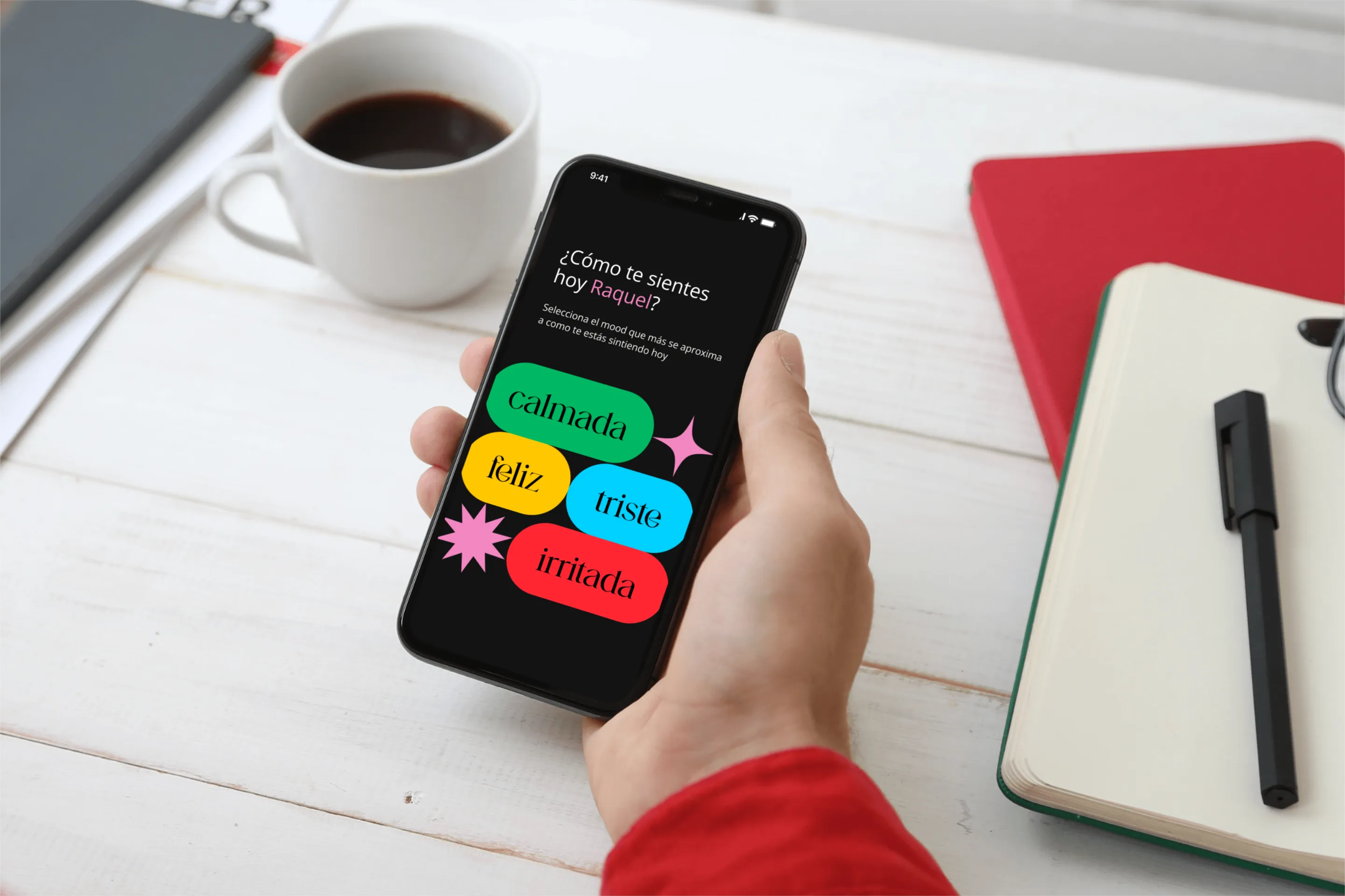
Watch a short video to explore the three key functionalities: My Mood, My Therapy, and My Goals:
User flow
Onboarding
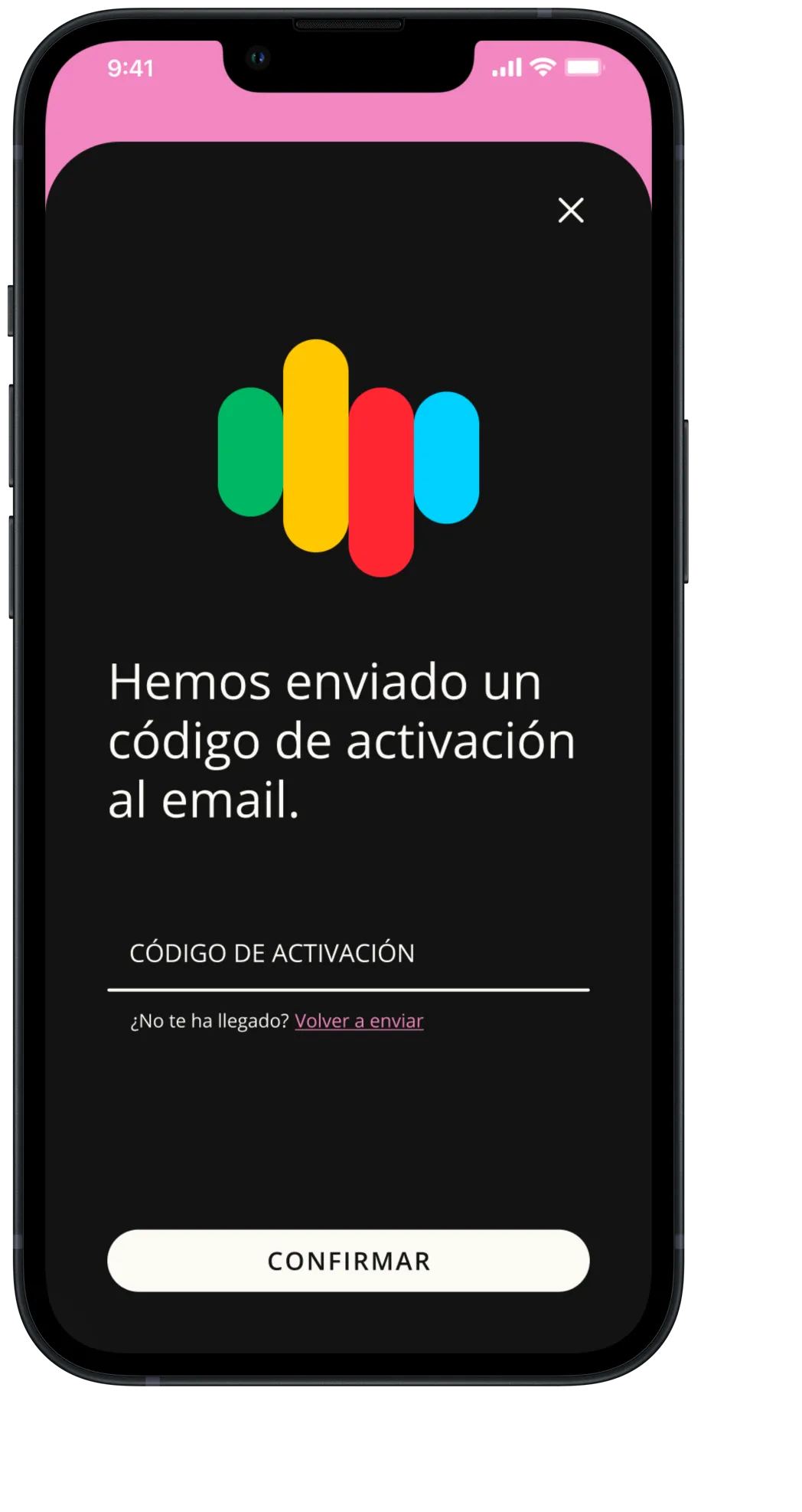
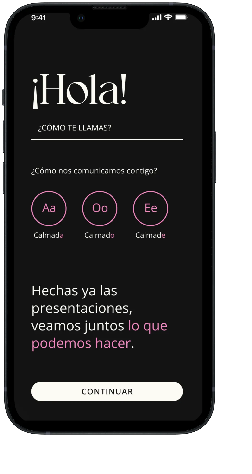
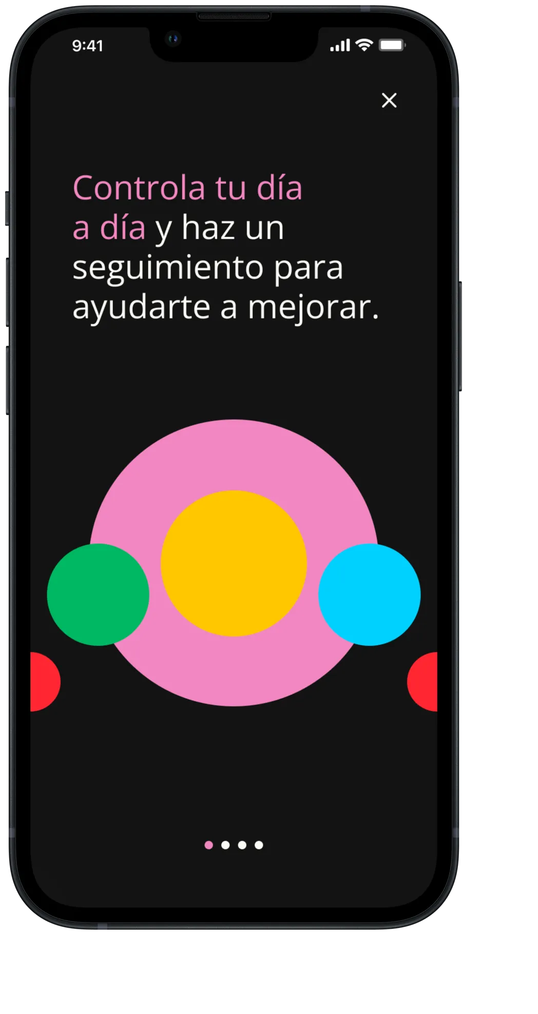
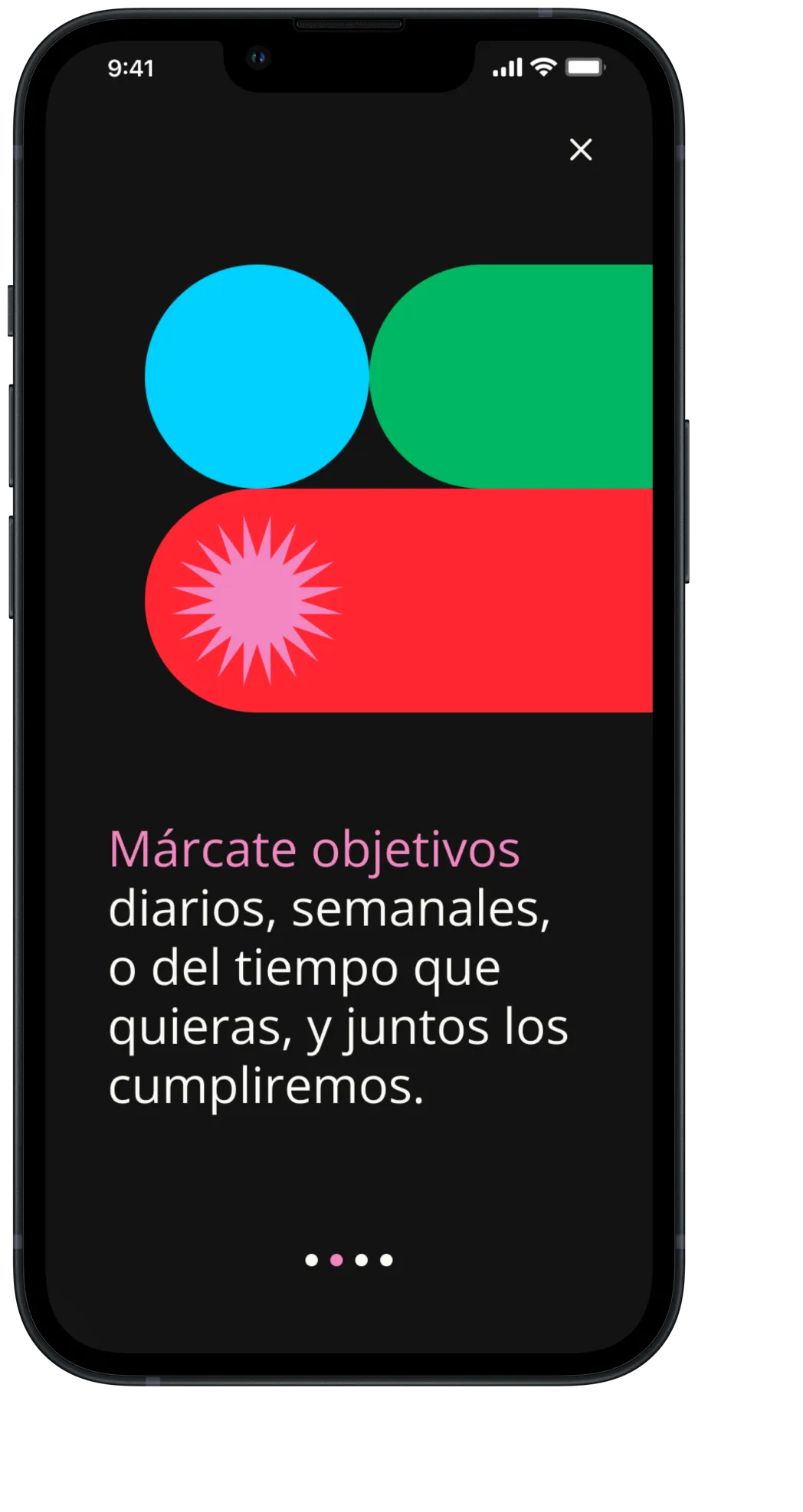
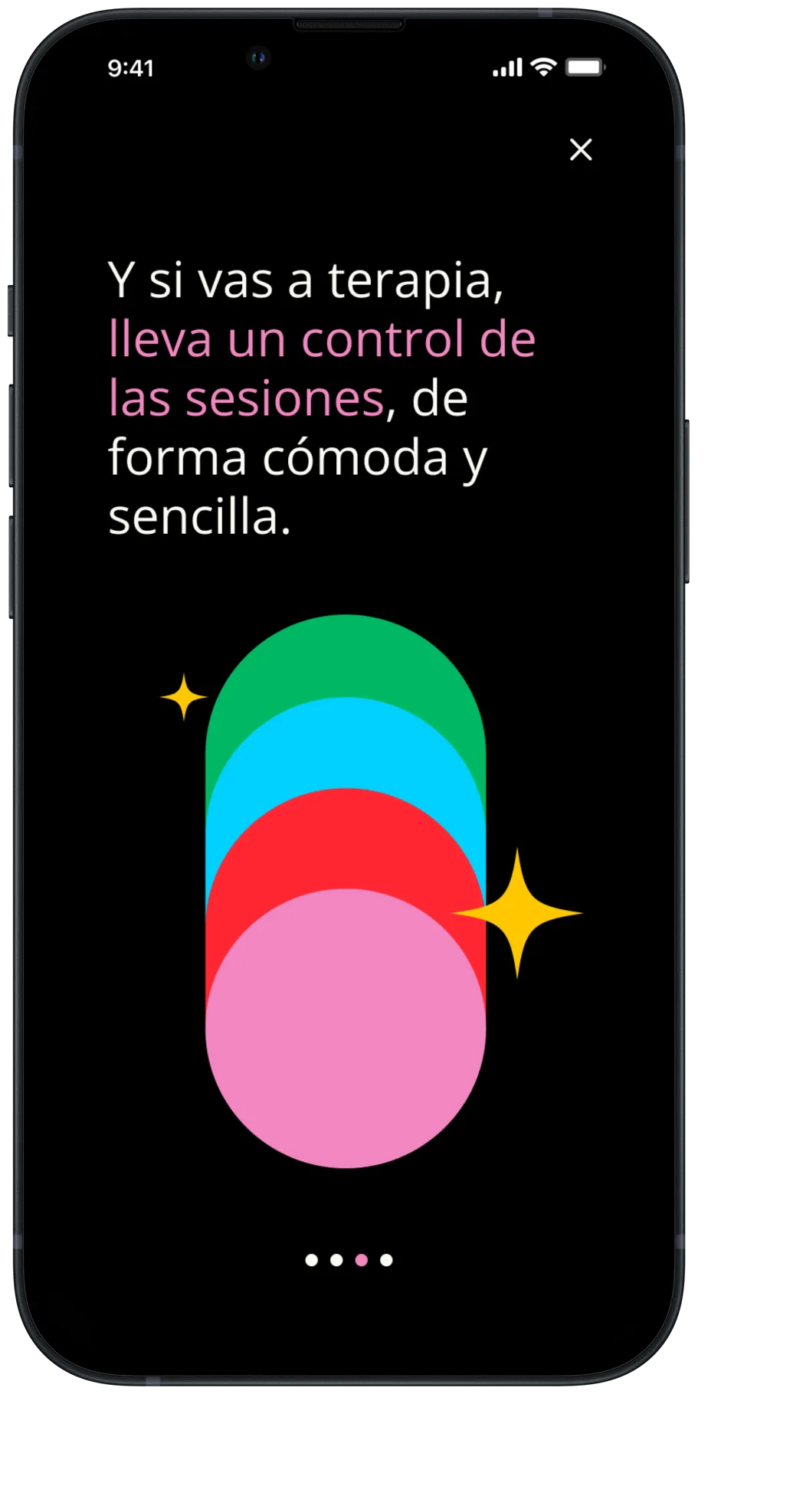
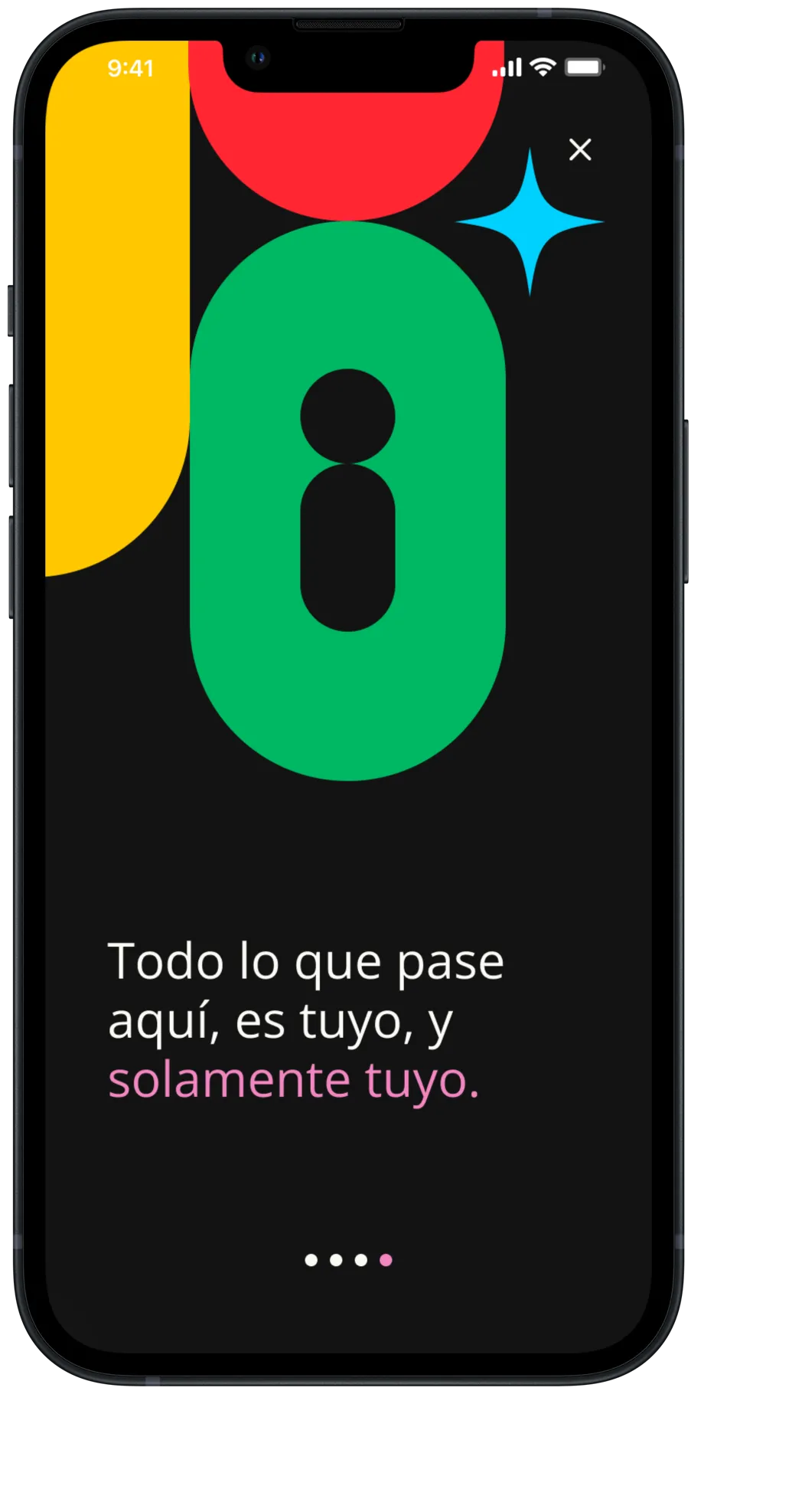
User flow
Therapy

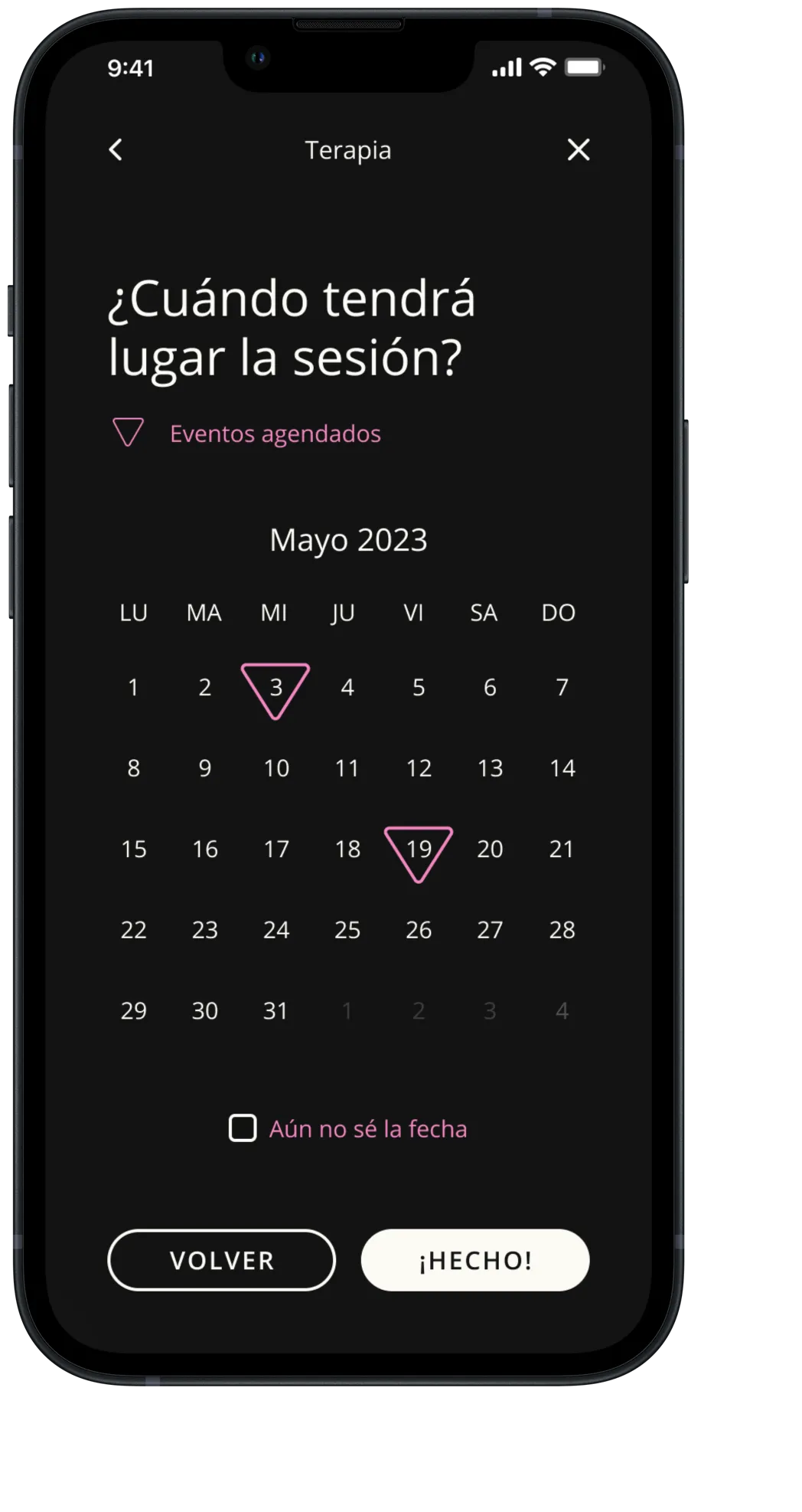
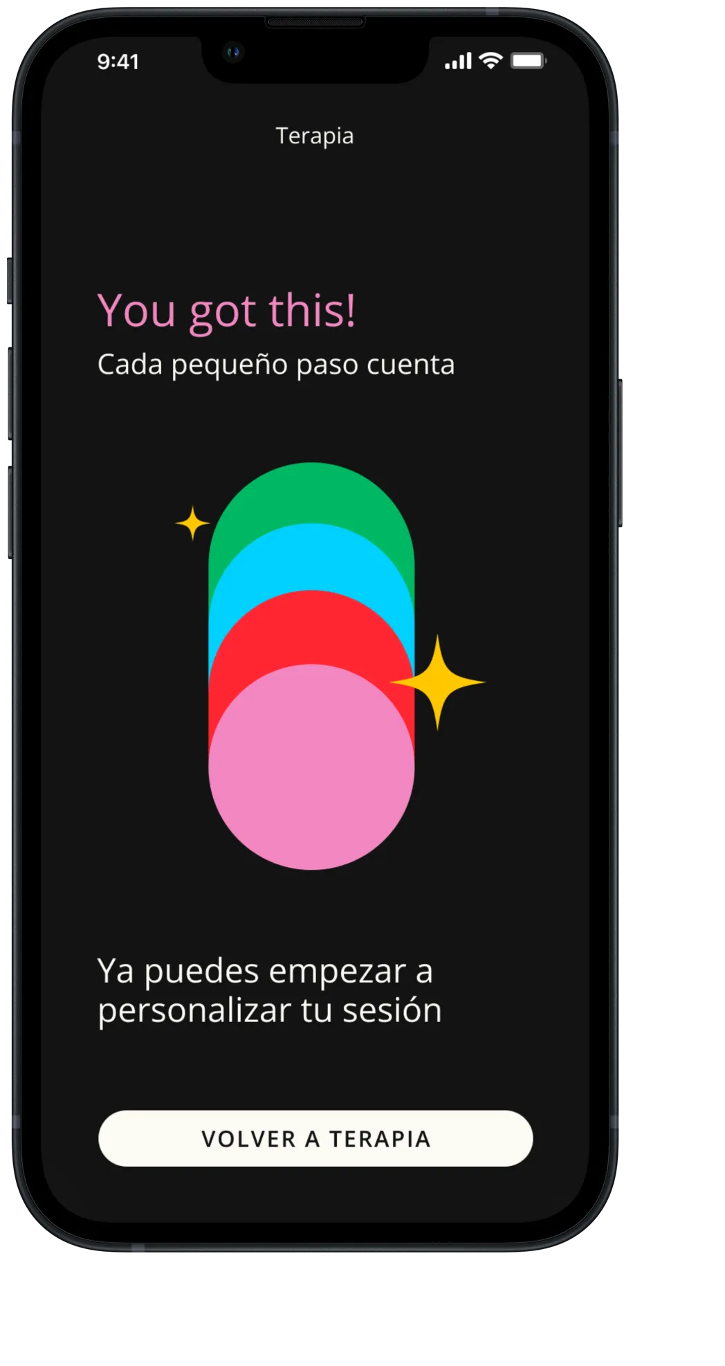
Next project
IDEALISTA
(Coming soon)